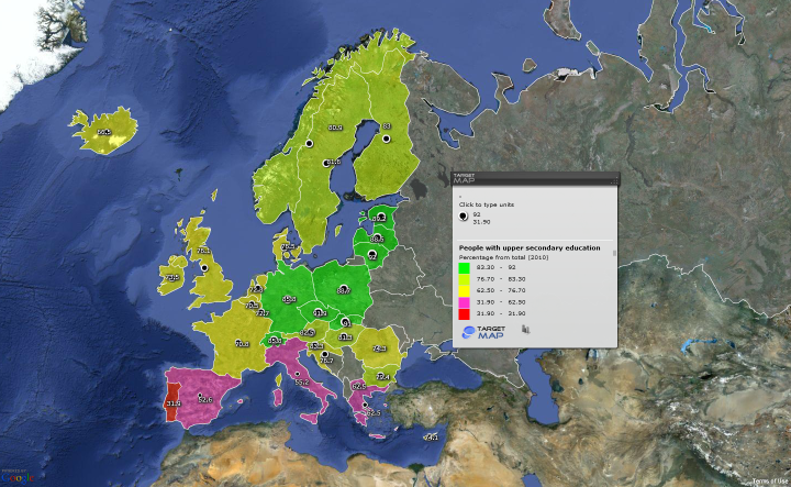
There are several online tools for data visualization including IBM’s ManyEyes and Google’s Chart Tools. For a recent post on the other blog to which I contribute I wanted to map the distribution of a variable on a geographical map of Europe. I decided that’s a good opportunity to try a site called Target Map which promises free, high-quality, customizable data maps. The result of my efforts can be seen below:

The link to the map is here.
Altogether, I can’t say that I am too happy with the mapping utility. My main quibble is that there are no default color palettes that translate well continuous variables into color hues. By default, the program offers highly contrasting color choices for the different categories but ones that don’t suggest the ranking of categories. And I couldn’t find an easy way to customize the color palette.
Data entry is OK, although once you select Europe as the geographical scope of your data, you can’t have any values for Turkey, for example, even if you try to supply them manually. Altogether, Target Map might be useful for some very small and inconsequential projects but for serious staff one should bite the bullet and get familiar with R’s map utilities (something I have been planning to do for a while).
Be First to Comment